2018 | Crue Web & Mobile AppCase Study
Cloud organizational tool that integrates apps you already use
Overview
Project details
Contributions
- UX Design
- UI Design
- Visual Design
Duration
3 months
Tools
- Pen & Paper
- Sketch
- InVision
- Adobe Illustrator
- iPad Pro
- UsabilityHub
Challenge
I was tasked with exploring the possibilities in which a new app can find a place within the saturated cloud storage and organization market. Though the brief was open-ended, the client wanted the app to cover standard features, such as:
- creating and organizing content
- uploading files from a computer or mobile device
- sharing a single item, or folder, with someone else (and vice-versa)
- connecting with other users for real-time collaboration in notes or documents
With this general brief, I had free reign to discover new angles to cloud organization and find the barriers and pain points that people in using existing apps.
Solution
My solution to the brief is Crue, a cloud organization web and mobile app focused on group collaboration and organization. Crue strives to increase productivity by integrating apps you regularly use, such as Google Drive or Dropbox, onto one platform. Crue stores and organizes your files, allows you to save links, and collaborate with others.
Process
Scouting out the lay of the land using surveys
To assess the cloud storage market and how people use cloud apps, I created a user survey framed around the client’s brief. I sent it out to friends, colleagues, and the general public to tap into new points of entry and learn current behaviors. From the results, I honed in on these two insights:
93% of participants benefit from using cloud storage services & apps in their daily and weekly lives, for personal and work purposes.
Many people cite convenience, accessibility, and ease of use as the top reasons they like to use the cloud.
75% of participants use more than one cloud service (the most popular being Google Drive and Dropbox).
The primary factor that guides peoples' choice of cloud services is what is already built into their phones and/or email service (e.g., Google Drive).
Assumption debunked
The market seems saturated, but cloud storage is still fairly new to the general public. Going through the results made me wonder if there was some way to consolidate existing cloud apps to help people manage their accounts better. I kept these ideas in the back of my mind as I forged ahead.
Developing user stories
Knowing the client needs and informed by the user survey, I prioritized the features that the participants deemed most important to help establish user stories. I broke it down to the high, medium, and low priority stories focused on new and returning users.
USER STORY EXAMPLES (New User)
As a new user, I want to...
High Priority
- Create or sign up for an account, in order to try out the cloud services
- See storage options and pricing in order to determine what I need for my uses
- Upload a file in order to store it in the cloud
Medium Priority
- Share a folder or file in order to send it to someone else
- Create/edit a document in order to collaborate with someone
Low Priority
- Add people to a file or folder in order to share or collaborate with them
- View recent files in order to easily find or share it on the go
Creating personas based on real people
Quantitative data aside, it was time to gather qualitative data to create personas. I interviewed three people (from the survey) over the phone to talk in-depth about their experiences with cloud storage. From their background and insights, I created these personas to establish our target audience: Startup Creative, Career Changer, Jack of All Trades.

Startup Creative
[I need] robust file preview functionalities — being able to view PSDs and AIs are a must!
Frustrations
- Unable to see previews of .AI or .PSD (Adobe design files)
- File organization & behaviors are not intuitive (you can't right-click or drag files) on Dropbox web UI

Career Changer
I love being able to create docs online, but I’m not the biggest fan of cloud organization.
Frustrations
- Google Drive’s organization of files & folders is unintuitive and messy
- Logging into Google can be a pain without your phone if you have 2-step authentication
- Google sheets doesn’t have full capabilities of Excel

Jack of all trades
Dropbox is more of an archive, G-Drive is what I actively use. I buy into each for different purposes.
Frustrations
Not having access when you don't have internet
Looking outwards to competitors
I performed a competitive analysis of a diverse range of cloud storage platforms that brought something different to the table. I analyzed Dropbox because it is one of the top cloud storage options, Evernote for its different approach (note-taking) to cloud storage, and Egnyte for its specific focus on security and enterprise.
Dropbox
- well-established brand
- modern and clean design
- ability to share files regardless of platform
- limited functionality without internet
- HIPPA compliancy
- limited free space

Evernote
- note-taking and list-making focus
- robust search features
- ability to save articles and web pages
- support and organization of media files and other documents (Word, Excel, etc.)
- limited offline access (free version)

Egnyte
- security & data protection
- app integrations
- scalability (meant for enterprise)
- less focus on personal users
- no free version
The new app could benefit by taking some cues from Evernote and Egnyte. Evernote positions itself uniquely by focusing on note-making and list-making. Egnyte already has integrations with robust document creation apps (Microsoft 365 and G Suite) so that there’s no need to re-create the wheel. Adopting the way they’ve executed their marketing and features can direct us to a solution that’s right for our audience.
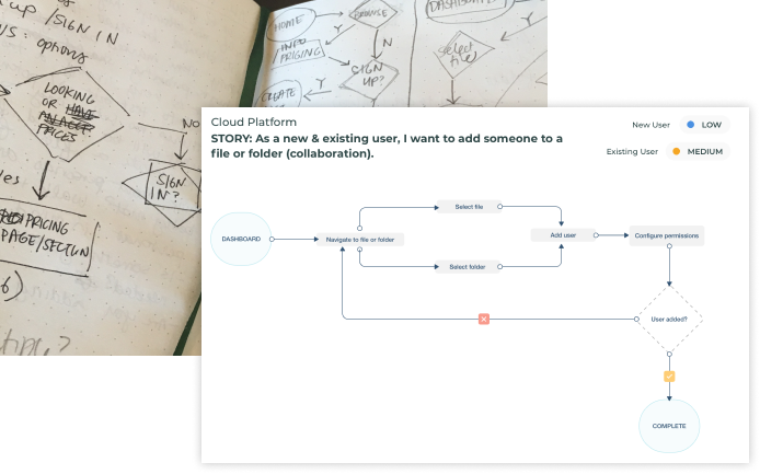
Thinking through user flows
Next, I got into sketching out possible flows to accomplish the goals of the user stories from the target audience’ perspective. I studied the ways Dropbox, Evernote, and Egnyte designed common flows (such as sign up, log in, and uploading files). I refined the flows that seemed most intuitive and straightforward into digital versions.
Execution & Testing
Low-fidelity wireframes
Usability Test Round 1
Armed with user research, stories, and personas, I build out the app with wireframes and started testing right away on real people in-person and remotely. The first round of usability tests highlighted the inconsistencies of the preliminary layouts and pain points in completing the following tasks: signing up for an account, creating a doc (content), organizing a file or folder.
Overall, the feedback revealed the functionality was there. The participants highlighted issues with the following:
- the landing page's content strategy
- improving the flow for organizing a file/folder
1. Generic copywriting & roundabout pricing: the copy on the landing page seemed generic and focused on getting the user to sign up for a paid app. This was problematic because it made the participants reluctant and wary to try it.
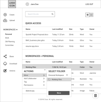
2. All the participants had difficulties organizing a file: most were able to achieve it with shaky confidence, while one participant could not figure out how to go about it. I definitely needed to revisit and rework this flow. Additionally, I learned that how I asked the question (in the imperative "organize the file") might confuse participants.
High-fidelity screens
A/B (Preference) Testing on Visuals Stylings
As I worked on high-fidelity mockups, I did extensive A/B testing on visual stylings from file menu placement to landing page backgrounds. I gathered feedback from other designers to improve visual design and interactions. The effort to put designs out there for testing and feedback allowed me to experiment, iterate, and validate quickly to get to the best solution within a intensive 2-week period.
File Menu Placement
Question: which menu placement seems most intuitive to you?
A. bottom menu = 8%
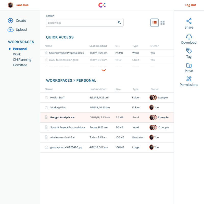
B. right side menu = 92%
Create Screen
Question: which "Create" screen do you prefer?
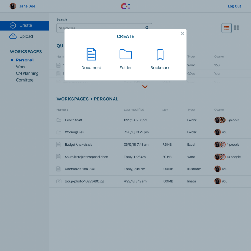
A. modal window popup = 81%
B. traditional menu = 19%
High-fidelity prototype
Usability Test Round 2
When it came time to do usability tests on high-fidelity mockups, the results were very positive. The high-fidelity mockups addressed many of the issues that arose in the first round regarding the lack of uniqueness of the landing page and the friction within the flow of organizing files. Some notable feedback were:
My mind feels at ease because it’s simpler. I like that the file menu pops up on the side more noticeably compared to other apps where it can be tiny or hard to find.
The color palette is pleasing and the design feels unified. I like the small details like the arrow icon which left a nice trail of digital breadcrumbs.
I attribute the successes to the thorough and focused testing and iteration. It was worth it rework the screens as needed. The changes made to the final product were minimal and mostly polishing up formatting and consistency. I don’t think the final design is perfect by any means, but it’s a fairly good solution that is clean, intuitive and feels enjoyable to use.
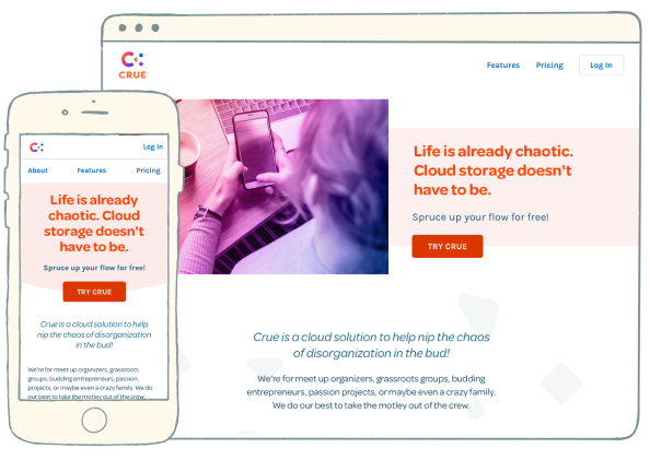
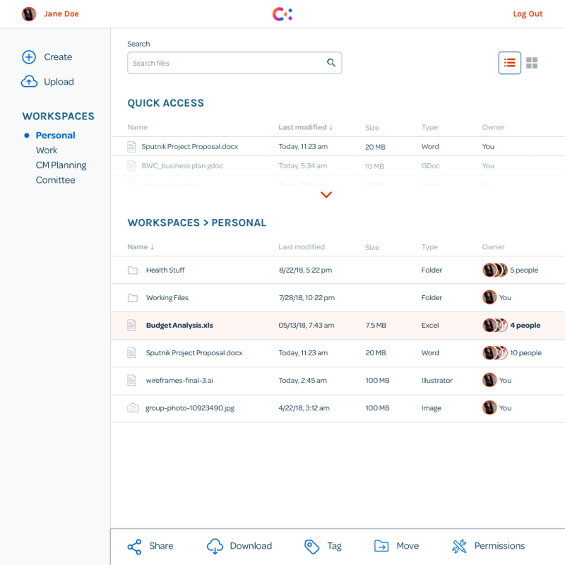
Final High-fidelity Screens
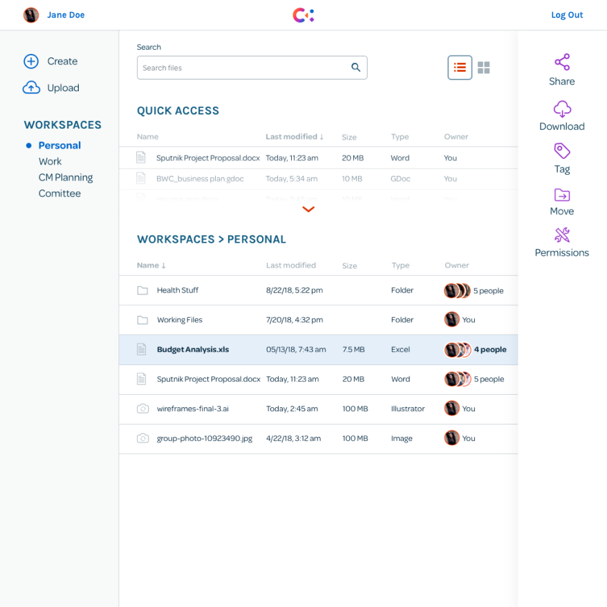
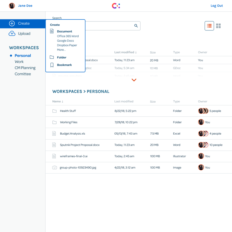
Internal Dashboard (Desktop)
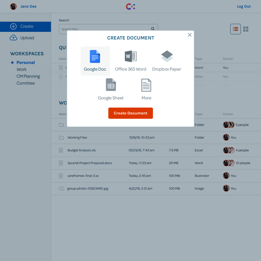
Create Document Screen (Desktop)
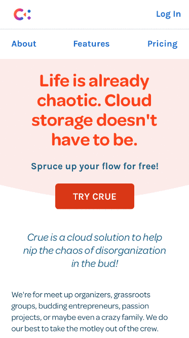
Landing Page (Mobile)
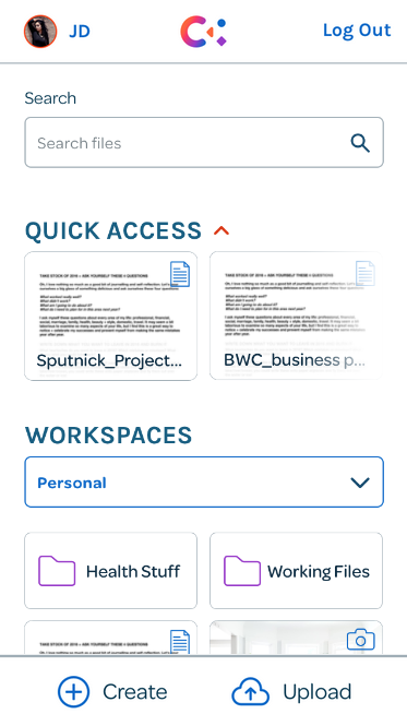
Dashboard Screen (Mobile)
Visual Design
Branding & logo design
For the Crue brand, I developed a logo design, style guide, and illustrations for the landing page. All these elements together can easily be extended to develop a visual design system that is adaptable to Crue’s growth as a brand and product.
Logo pencil sketches for Crue
Digital Iterations
Final Logo Design
The name Crue was derived from "accrue" meaning growth and increase, and "crew" meaning group of people. This name was chosen because it captures a feeling of togetherness and growth. The four letter name is also easy to remember.
Brand traits: flexible, friendly, warm, collaborative, and organized
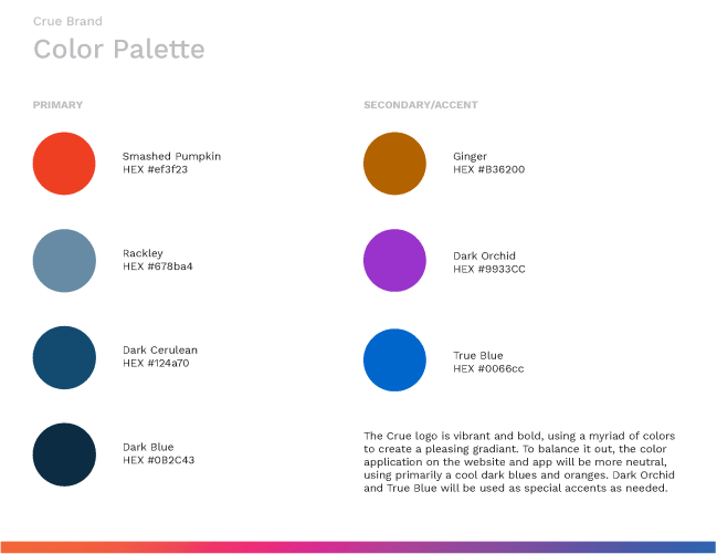
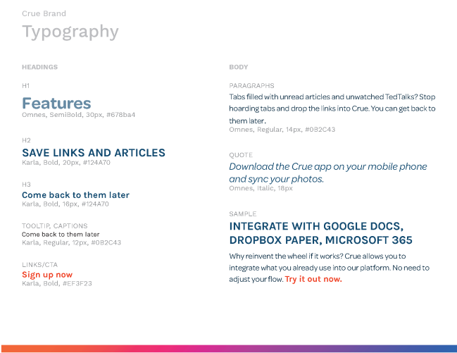
Style guide
For the overall style guide, I went with a vibrant and colorful route, using gradients and bright hues to give a friendly and warm vibe. In the logo, the gradient in the letter C represents harmony and collaboration. The other shapes (square, triangle, and circle) are solid colors to represent different ideas and people coming together to synthesize with the letter C. Since the logo is so expressive and bold, the color and type treatments to the rest of the web app are more neutral to bring balance to the overall design.
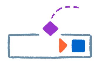
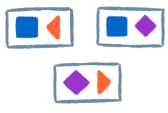
Landing page illustrations
After developing the logo, I became inspired by the geometric shapes within it. I wanted to find ways to incorporate the motif throughout. I pushed my skills and ventured into creating simple digital illustrations in a loose pen style. Fortunately, my gamble worked out as the illustrations helped bring texture and creative energy to the landing page.
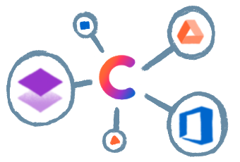
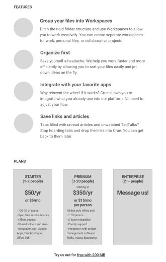
Integration

Organizing files
Saving links
Workspaces
Takeaways
Developing Crue from idea to prototype was a comprehensive process that provided many lessons for future iterations and projects. A few of those lessons were:
There's always going to be something to do, whether it's to design or test on.
When you start getting lost in the weeds, refer back to user stories and priorities to bring focus. In this case, MVP is what we're going after so it's really important to hone in on high-priority stories. On top of that, you'll need to consider deadlines, which makes this even more critical that you're not wasting time making everything little thing functional.
Don't force uncommon patterns for the sake of being different.
Of course, this is not to be applied generally. When the goal is innovation, trying unconventional routes is encouraged. However, there are just some things that users are used to, and straying from that can create dissonance. Simpler is better.
Small things that help direct the users' focus can go a long way.
When studying other apps and common design patterns, one of the techniques that helped make exceptional experiences was how well it directed the user's focus with small details. This seems to play a large role in reducing cognitive load. In Crue, I made conscious decisions to use visual cues like arrows and graying out options or part of the screen. This allowed users to go through flows easily.